Wiinvite
Event Organising App Design
Web App
Product Development
Wiinvite
July 2021 - March 2023
UX/UI Designer & Content Creator
Overview
Adapting the Interface to the Needs of the Target Group
Wiinvite was designed to help young people organize social events in a fast, fun, and effortless way. To ensure the app resonated with its audience, I worked on improving the user interface (UI) and user experience (UX) before its launch. The goal was to create a visually appealing, intuitive, and engaging interface that would attract and retain young users.
The Challenge
Wiinvite’s primary audience consists of young people aged 14–25 who are socially active and highly engaged with digital experiences. The existing interface needed improvements to ensure:
Stronger appeal to a younger audience
A more engaging and seamless user experience
A fresh, trendy look that aligns with today’s design standards
The Solution
Step 1: Analyzing the Existing Interface

Before designing the new UI, I conducted a deep dive into the current interface to identify areas for improvement. Key findings included:
Predictability – Some content layouts needed optimization to make the process (e.g., event creation, account setup) more structured and predictable.
Vivacity – The interface lacked vibrancy. Adding more colors and graphics would create a more exciting and fun experience.
Transparency – Users needed more clarity on why certain personal information was required and how it would be used.
Step 2: Market Research & Competitive Analysis
To align Wiinvite with younger audiences’ expectations, I researched successful apps used by 14–25-year-olds. The three most popular ones shared these characteristics:
They foster a sense of connection and community (e.g., Snapchat, TikTok).
They challenge traditional design guidelines to create unique, trendy interfaces.
They prioritize simplicity and ease of use.
From this research, I identified opportunities to make Wiinvite more engaging without overwhelming users.
Step 3: Understanding Young Users’ Digital Behavior
I analyzed studies on how young audiences interact with digital products and identified key behavioral patterns:
Lower patience levels – The interface needed to be fast and highly responsive.
Skepticism about sharing personal data – Information requests should be justified and minimized.
Preference for clear, concise content – Overloading users with animations or unnecessary interactions should be avoided.
From these insights, I established design principles for the new interface:
✅ Minimal data collection & transparency – Clearly explain why information is needed.
✅ Optimized content & graphics – Maintain a balance between engagement and performance.
✅ Simple yet modern design – Avoid childish elements while keeping the UI fresh and trendy.
✅ User control over shared data – Ensure privacy settings are intuitive and accessible.
Design & Implementation
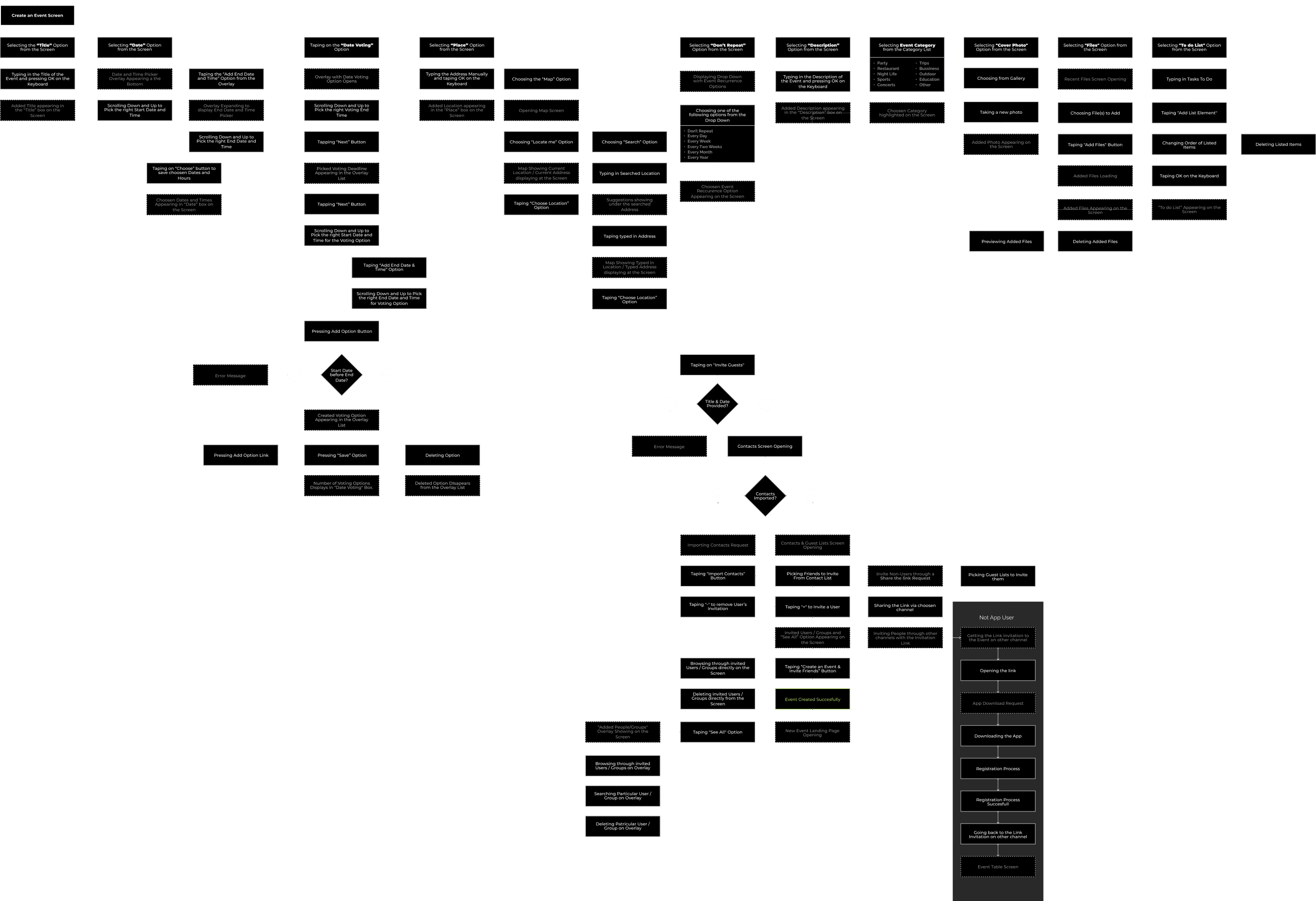
User Flows & Prototyping
To refine the user experience, I used Figma to prototype and validate new interaction flows. Zeplin facilitated smooth collaboration with developers by managing project progress efficiently.
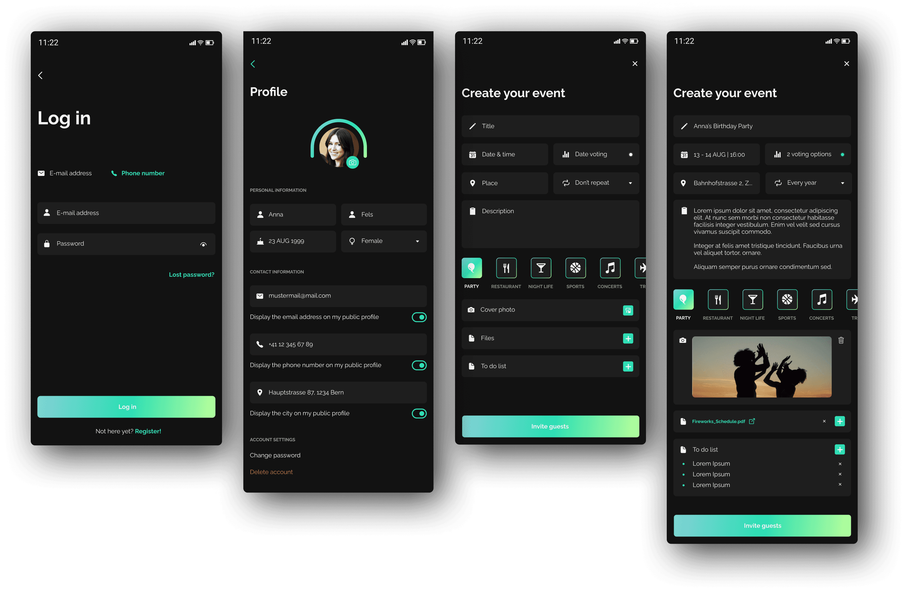
Account Creation

Event Creation

Wireframes
I created low-fidelity wireframes to establish the structure and hierarchy of the new UI, ensuring a clear and logical flow before moving into high-fidelity designs.

Design & Style Guide
To ensure consistency, I developed a design system incorporating:
A vibrant color palette to enhance excitement and engagement.
Modern typography that balances readability with a youthful feel.
Playful yet intuitive icons and buttons to create a seamless interaction experience.
Colors

Typography

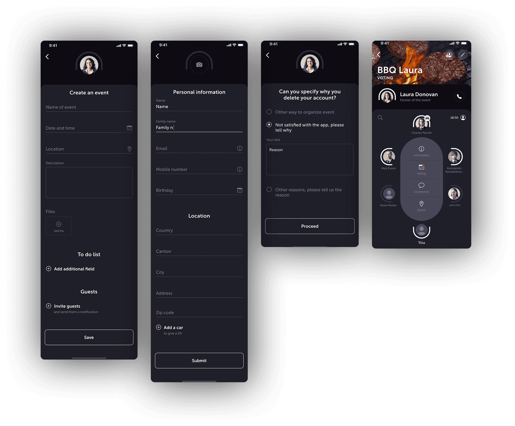
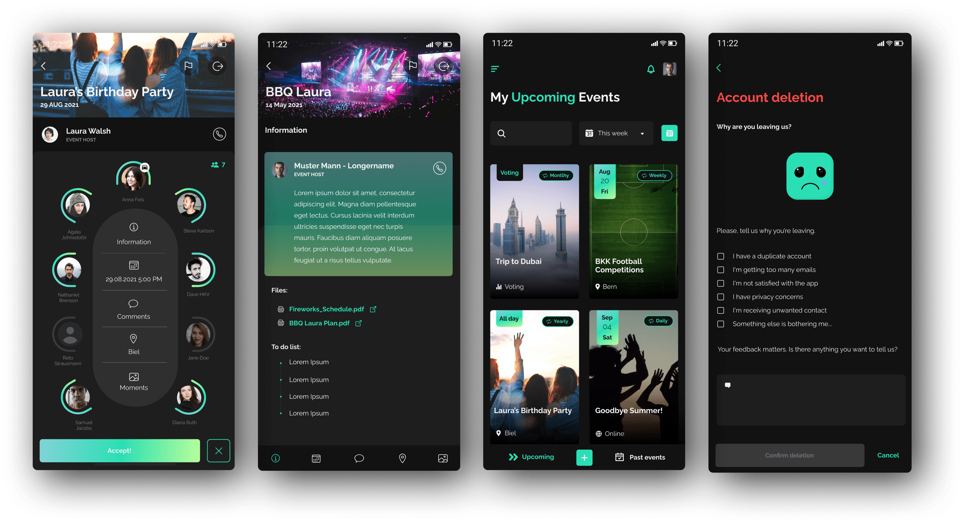
Results: Before & After UI Comparison
Before

After


Key Improvements:
✅ A visually engaging design aligned with young users' expectations.
✅ A streamlined event creation process, reducing friction and confusion.
✅ Improved clarity and transparency in data collection.
✅ A fresher, trendier UI inspired by leading youth-centric apps.
Conclusion
Through market research, user analysis, and iterative design, I successfully revamped Wiinvite’s interface to be more intuitive, engaging, and youth-friendly. The redesign ensures that young users can effortlessly create and join events while enjoying a modern and vibrant digital experience.
***

