NOMOQ
Designing a Scalable UX for Custom Beverage Packaging
Web App
Product Development
NOMOQ
September 2022 - April 2025
UX/UI Designer & Product Owner
Project Overview
When I joined NOMOQ, I didn't just sign up to design interfaces, I signed up to revolutionise how small beverage brands could access custom packaging. For 2.5 years, I wore multiple hats as UX/UI designer, Product Owner and No-Code/Low-Code Developer, building a self-service B2B platform from the ground up. Working in an agile, cross-functional team, we turned what started as a scrappy no-code prototype into a scalable product that grew alongside the company. This is the story of how we made custom beverage cans accessible to everyone - no minimum quantities, no gatekeepers, just pure creative freedom.
Business Context & Background
Let me paint you a picture: imagine you're craft brewery wanting to launch a limited edition beer, or a startup creating a new energy drink. Traditional packaging companies would laugh you out the door unless you ordered 250 000 cans minimum. That's where NOMOQ came in - we offered digitally printed cans with no minimum order quantity. Revolutionary? Yes. Complex to execute? Absolutely.

What we set out to achieve
🎯 Automate everything - We wanted small customers to feel empowered, not dependent on account managers.
🎯 Scale smart, not hard - Help the business grow without drowning in manual work.
🎯 Bridge two worlds - Create an interface that made customers happy while keeping our production team sane.
🎯 Change behaviours - Convince people to stop calling and emailing, and start clicking.
🎯 Think big - Build something that could handle both indie brewers and major brands.
Challenges


Strategy & Approach
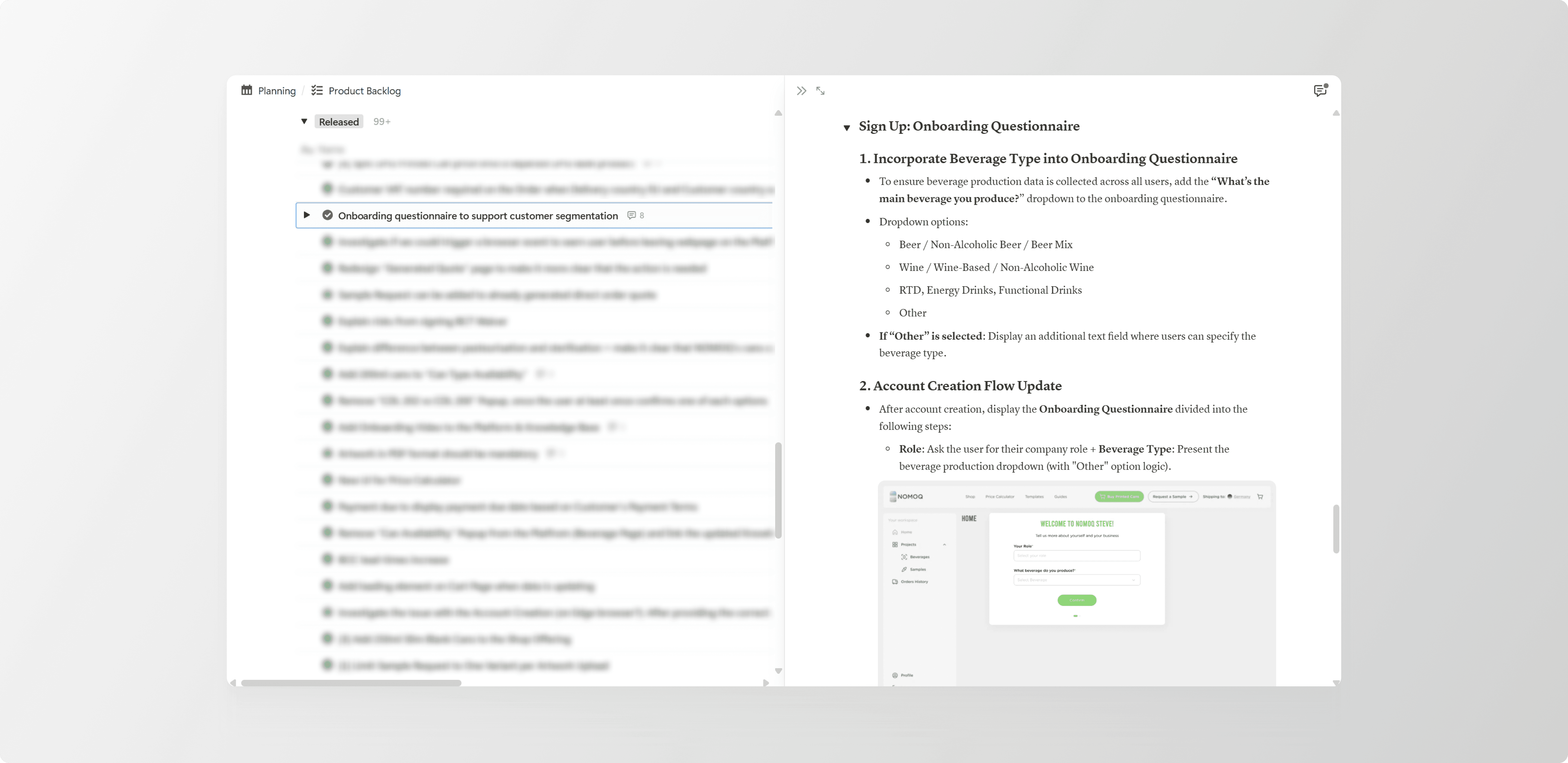
I quickly learnt that building a product like this required more than just good design skills, it demanded strategic thinking, endless adaptability and the ability to translate between "customer speak" and "operations speak". My approach became a blend of three methodologies that kept me grounded while navigating constant change.

Design Thinking: Get curious, Define the real problem, Go wild with solutions, Test small
I became a detective of sorts. Every customer conversation, every confused click in Hotjar, every frustrated email to support, they all told a story. My days were filled with interviewing customers who'd say things like "I just want to see my design on a real can" and operations teams warning "but we can't print that without checking the pH levels first!"
My role:
I chatted with many, many users and stalked their clicks (hello, Hotjar 👀) to uncover what really drives or frustrates them.
I connected the dots between ops, sales and support by understanding their daily challenges and building solutions that worked for all.
I ran discovery workshops that felt more like therapy sessions, getting everyone to admit what was really broken - sticky notes, hot takes and Aha! moments included.
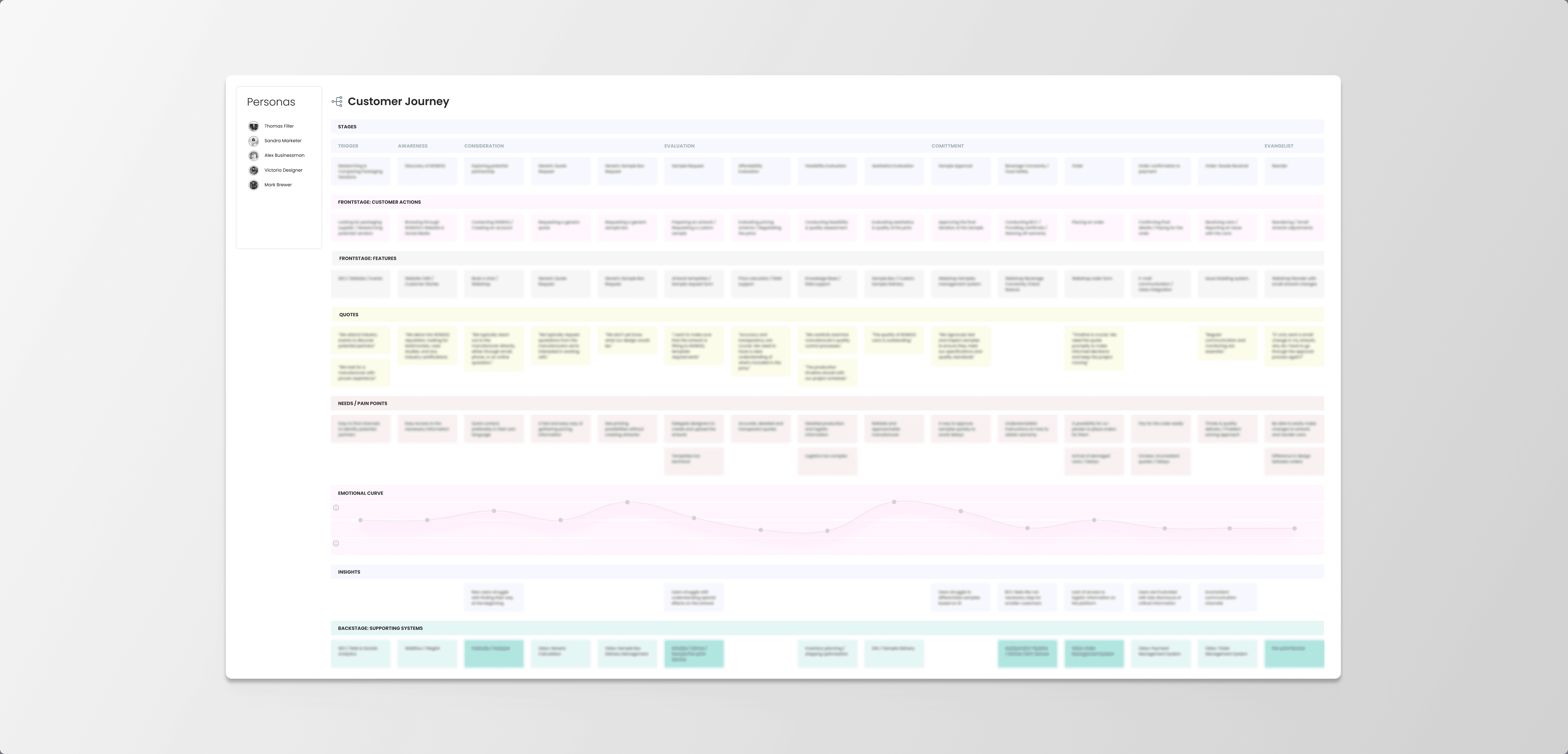
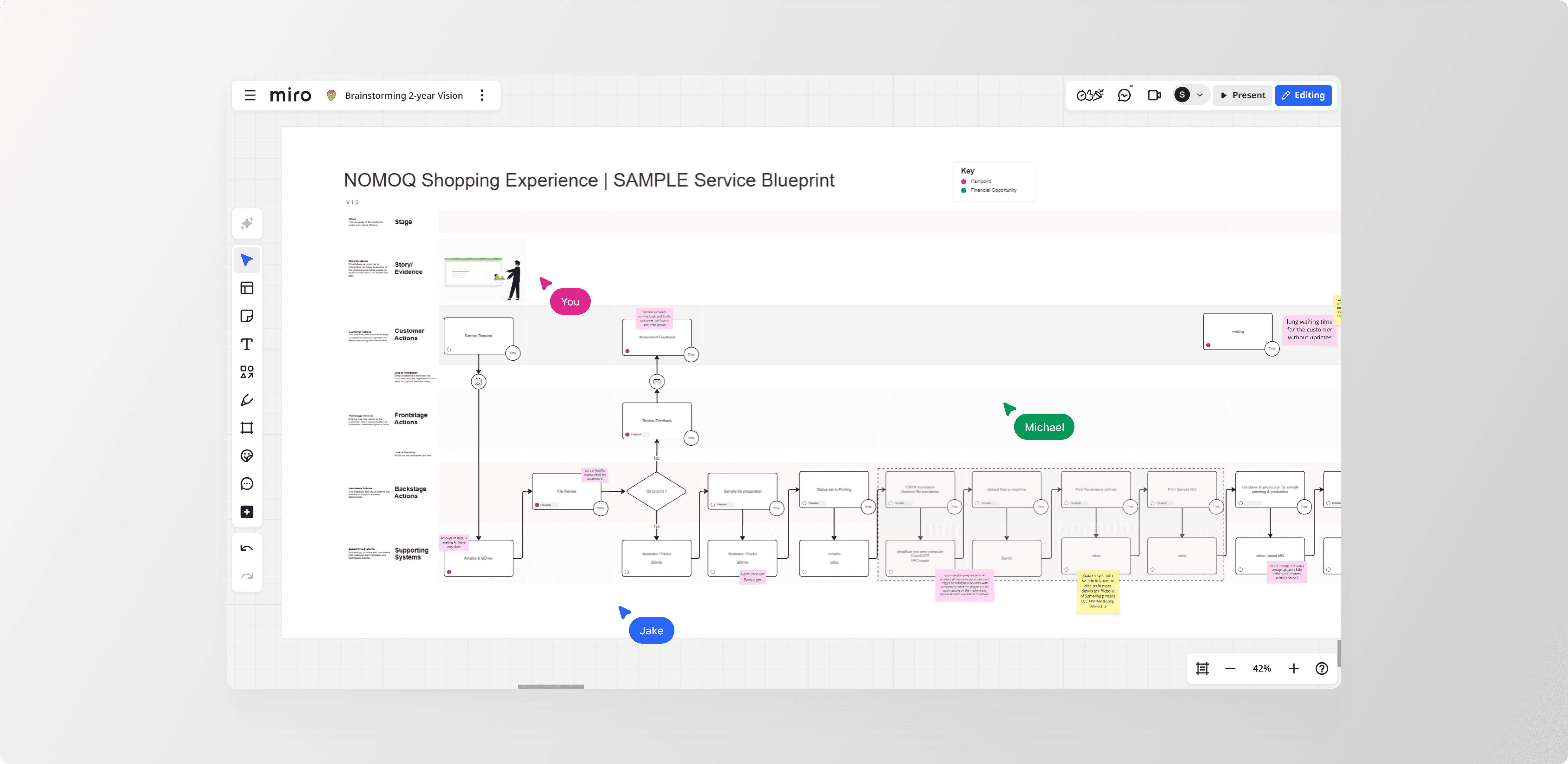
I created journey maps that looked more like adventure maps, complete with dragons (aka pain points).
What I delivered:
→ User personas that became so real, we named them and referenced them in meetings


→ Journey maps that made stakeholders question life choices
→ Problem framing sessions that turned complaints into opportunities (and drama into strategy)
→ Wireframes and User Flows that kept changing lanes until they hit the sweet spot
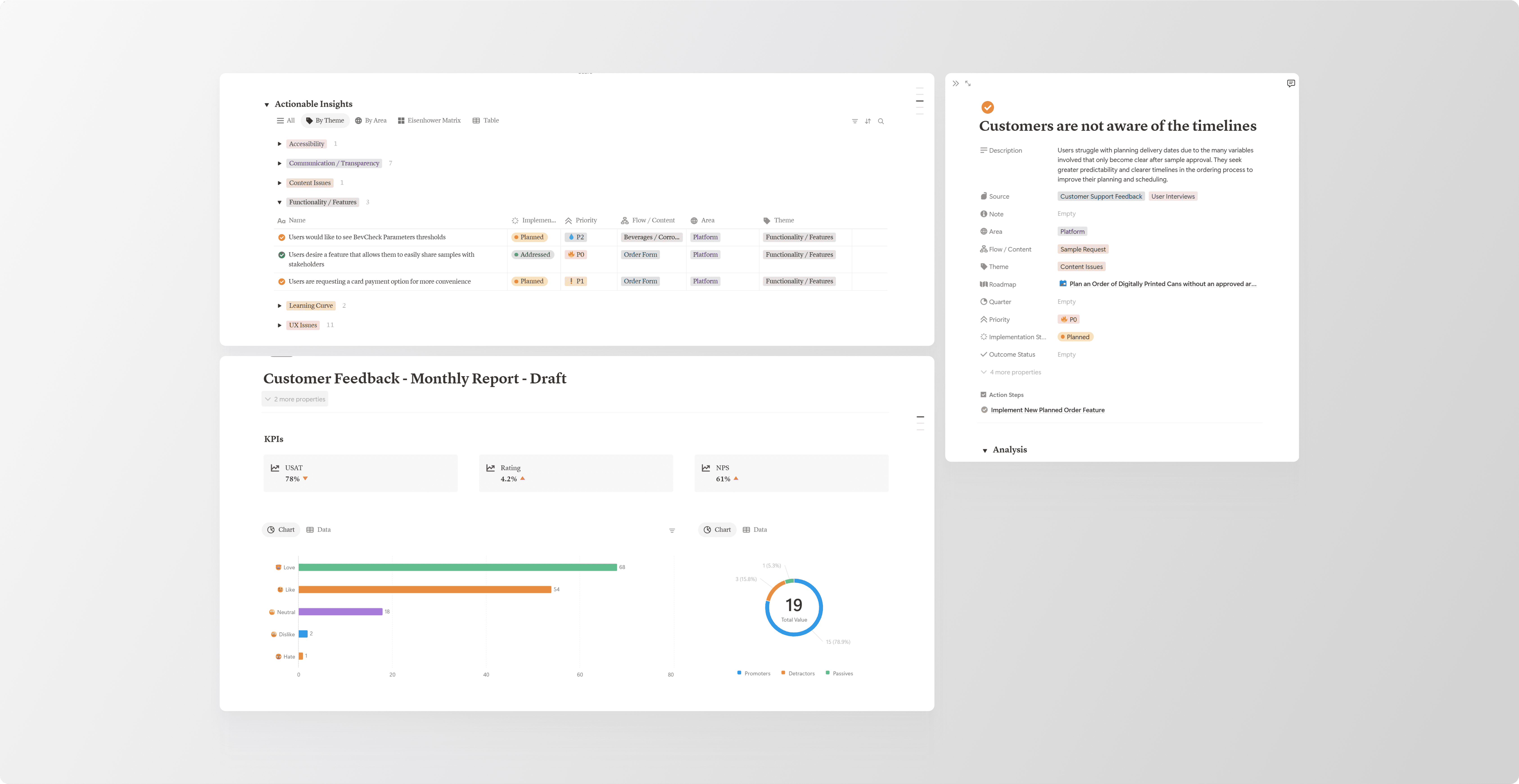
→ Customer Insights Database so insightful, it practically wrote the roadmap itself
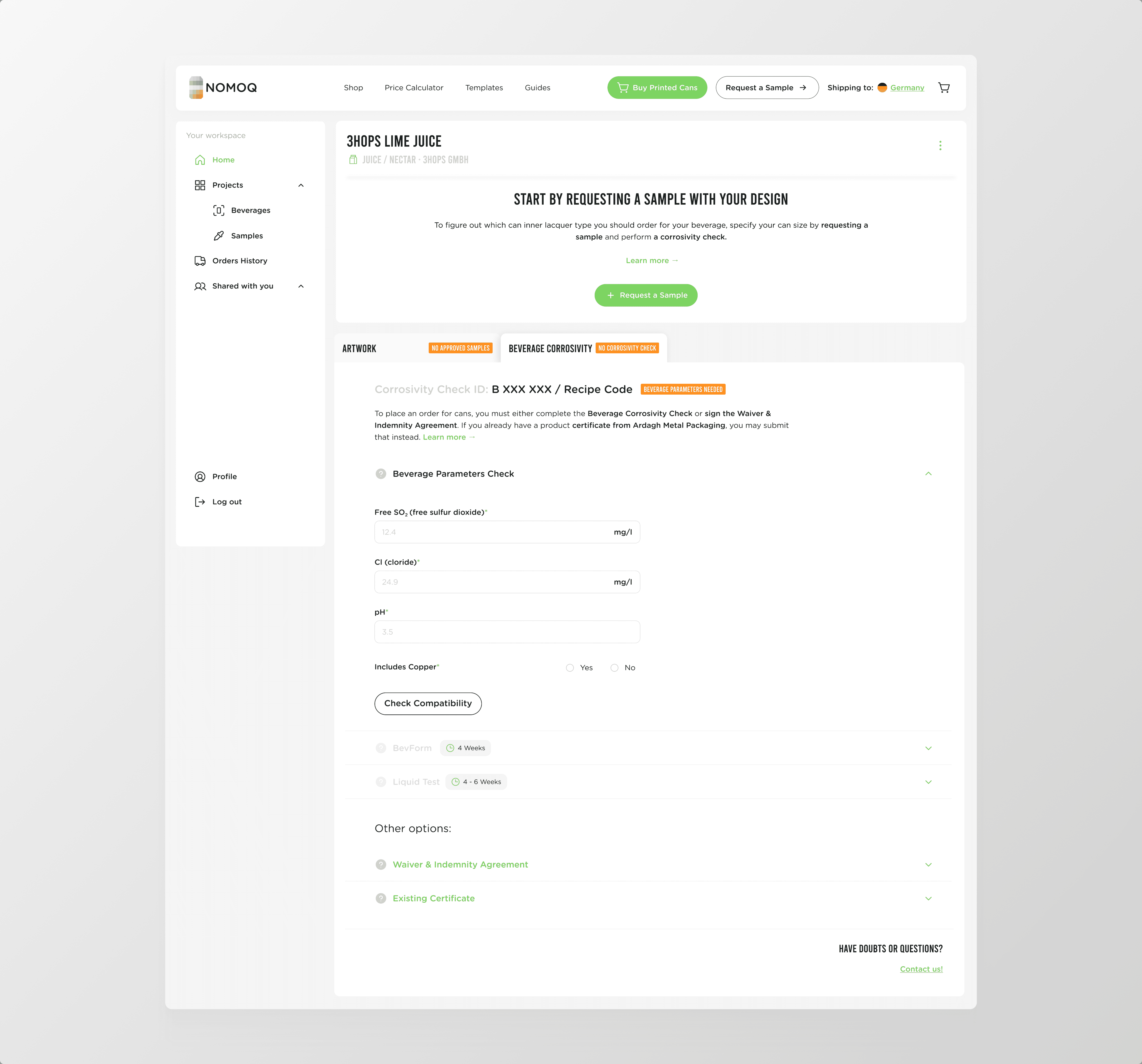
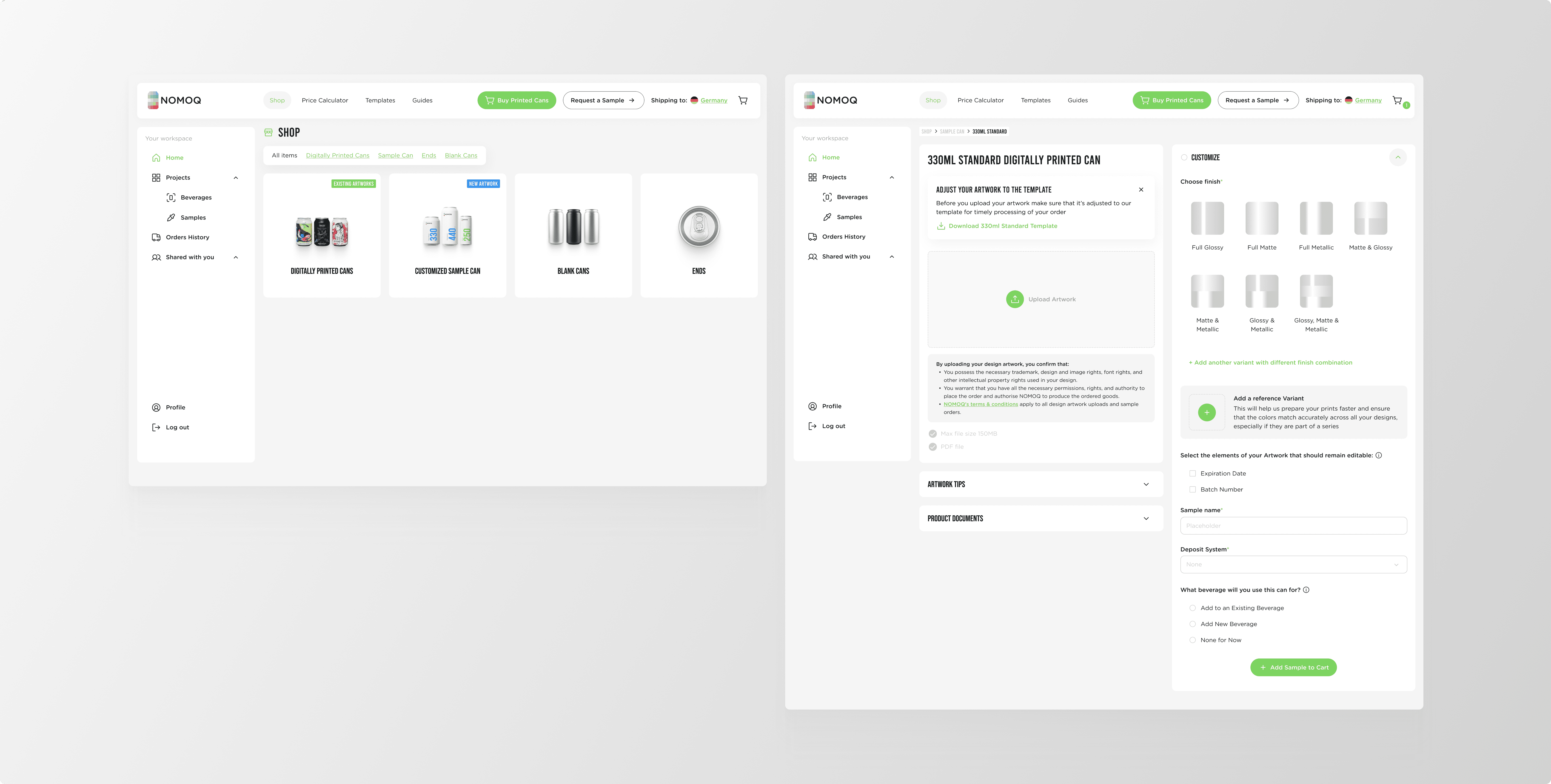
Success Snapshot: Transforming Beverage Compliance Testing
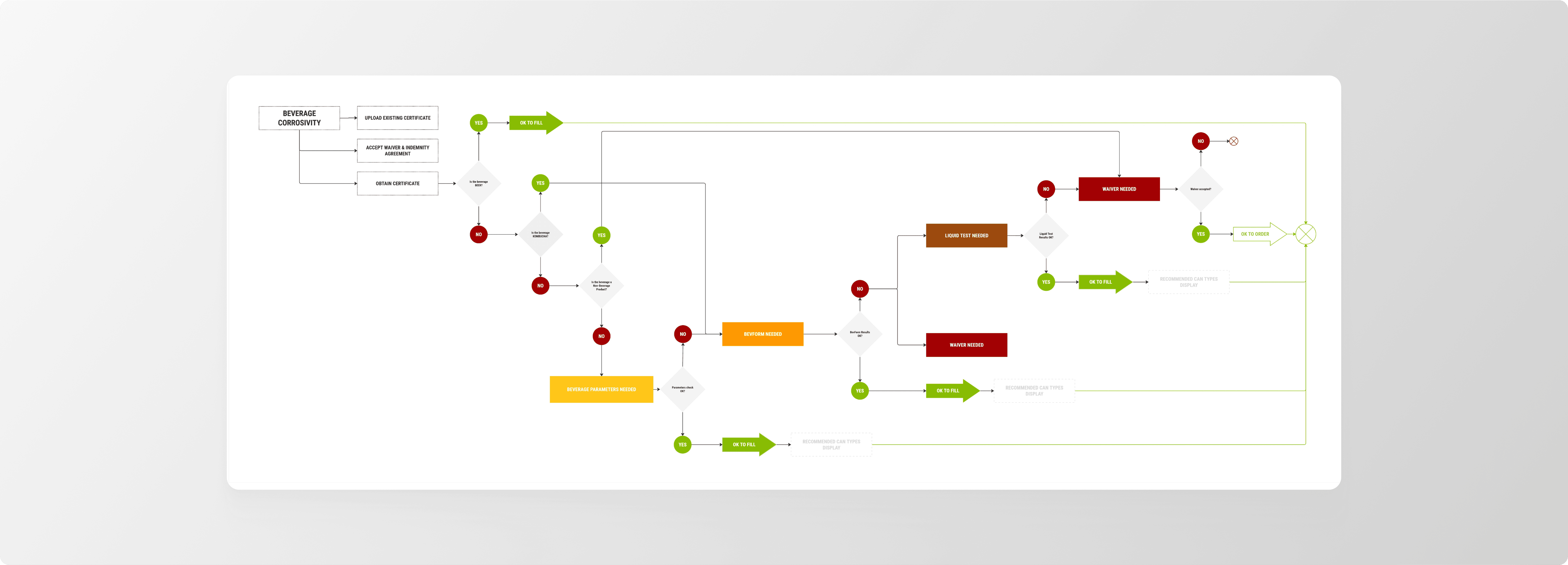
Imagine your customers having to prove their drink won't corrode its own packaging before they can order the cans. That was the reality at NOMOQ – a mandatory compliance step that had evolved into a frustrating maze of manual checks, confusing spreadsheets, and endless email threads. While regulations required it, our users were struggling.
As the product designer, I was tasked with making this complex process actually usable.
🔍 Step 1: Understanding the Complexity
I started by diving deep with our lab team to map out all the requirements:
○ Which beverage types triggered specific tests
○ What parameter levels (like pH and chloride) were considered safe
○ What happened when products fell outside acceptable ranges
📐 Step 2: Designing a Clear Path Forward
With this knowledge, I created a detailed user flow that broke down the complexity into digestible steps. The key principle: show users only what they need, exactly when they need it. No information overload, just clear guidance through each decision point.
🧪 Step 3: The Game-Changing Discovery
Testing a clickable prototype revealed something crucial – users didn't actually mind the compliance check itself. They were frustrated because they didn't understand what was happening or why.
Once I cracked the pain-point code, I added targeted improvements:
✅ Contextual tooltips explaining technical requirements
✅ Strategic links to helpful documentation
✅ Plain-language labels (goodbye, confusing jargon)
✅ Clear progress indicators showing where users were in the journey
The result? What once felt like navigating a maze became a guided, transparent process.
The Impact
Compliance completion rates increased significantly across all user segments. Smaller clients who previously abandoned the process now completed it easily. Enterprise clients particularly valued the professional, transparent approach, saying it increased their trust in the platform.
For our internal teams, this meant fewer support tickets and clearer client communications. We transformed user sentiment from "what is this?" to "that made sense" - turning a regulatory requirement into a smooth, understandable experience.
That’s the kind of UX glow-up I’m proud of. And this is the sneak-peak of it!
Lean Startup: Iterate fast, Watch & Learn, Fix it
Here's where things got interesting. Armed with Bubble (a no-code platform) and a healthy dose of optimism, I became a one-person feature factory. The beauty of no-code? I could test an idea on Monday and have real users clicking it by Friday.
My daily reality:
Building components in Bubble while simultaneously teaching myself how Bubble worked.
Shipping features and then obsessively watching usage data like it was Netflix.
Creating automated tests because manually testing everything was slowly crushing my soul.
Celebrating small wins (like when users finally found the upload button without help).
What I produced:
→ A design system that survived multiple pivots

→ Features that users actually used
→ Usage reports that sometimes hurt to read but always taught us something
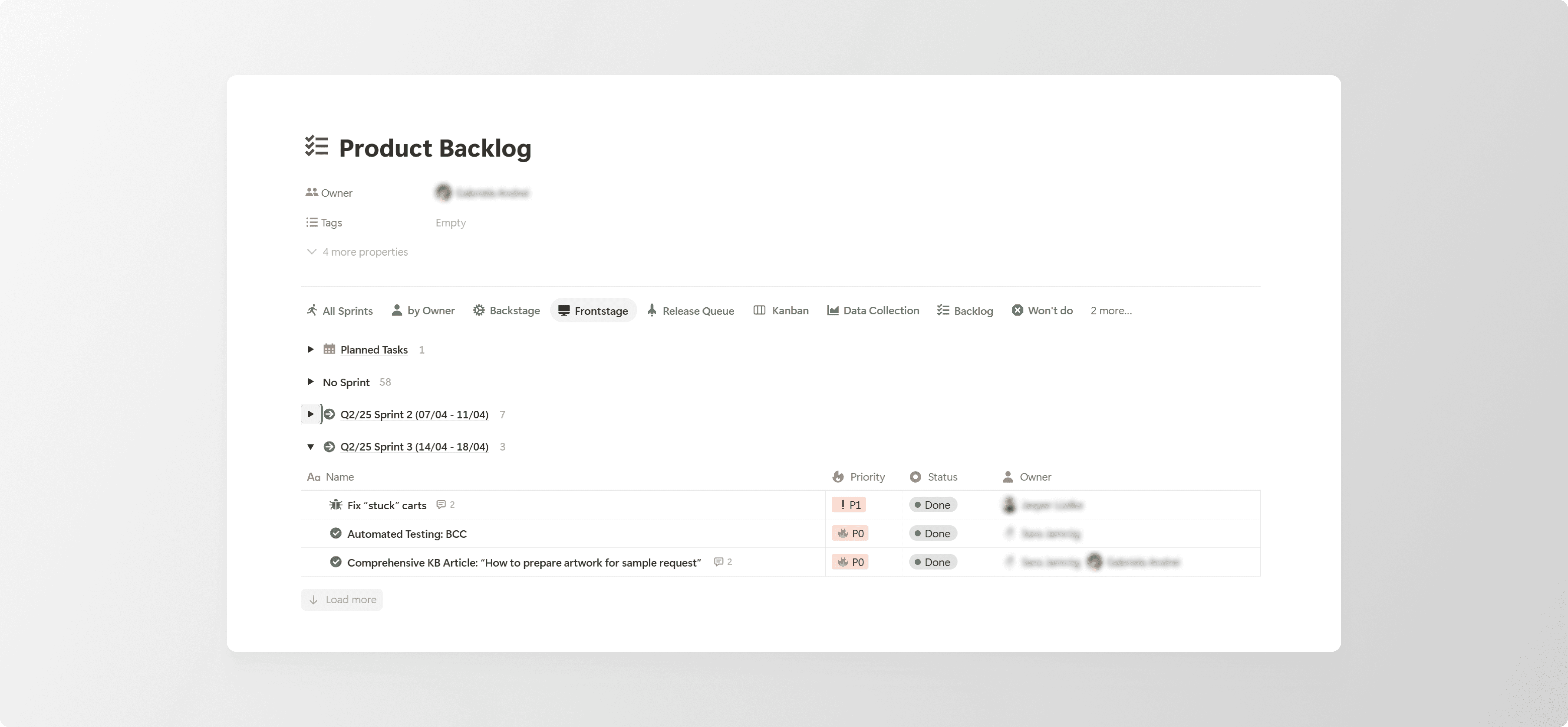
Success Snapshot: When a Single Button Saved the Day
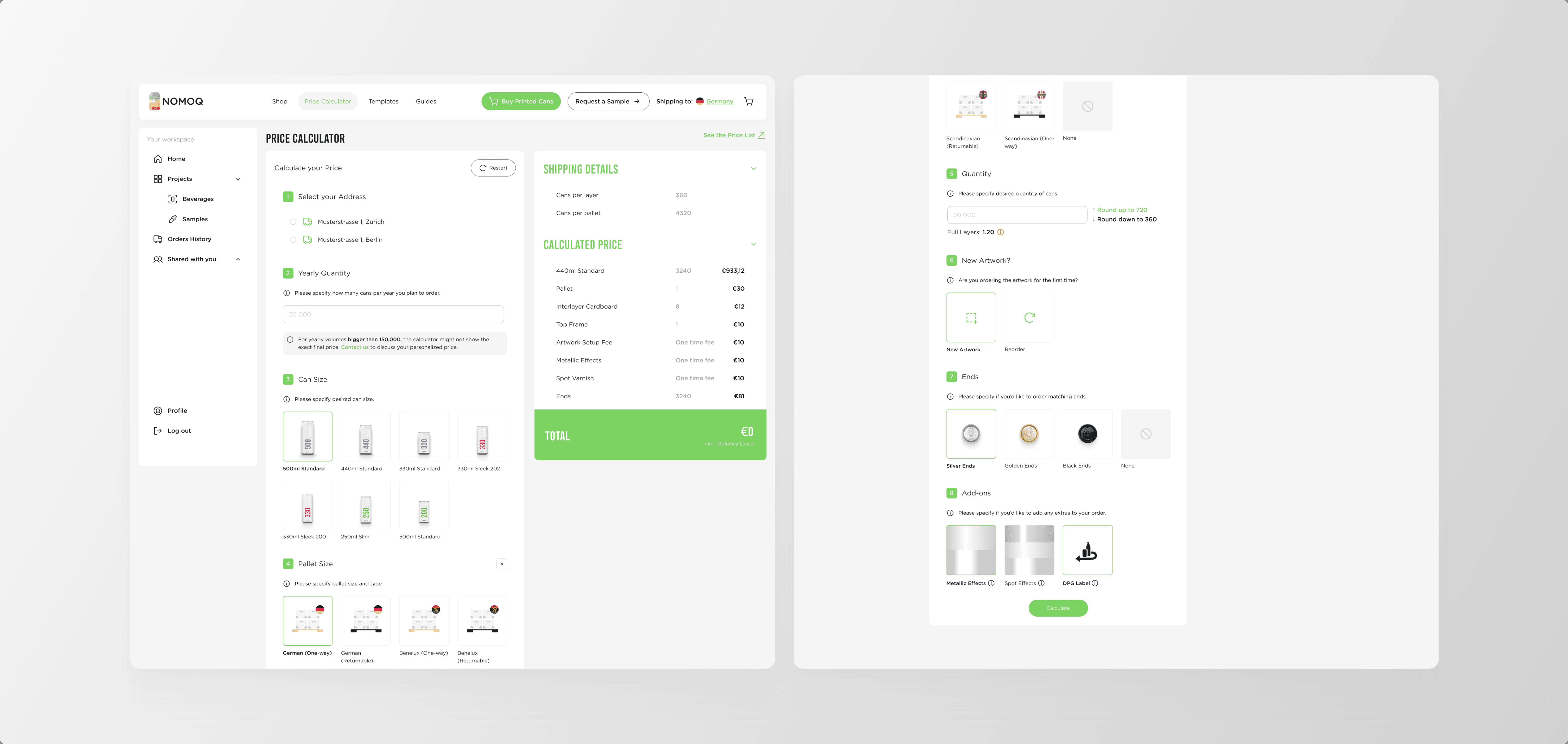
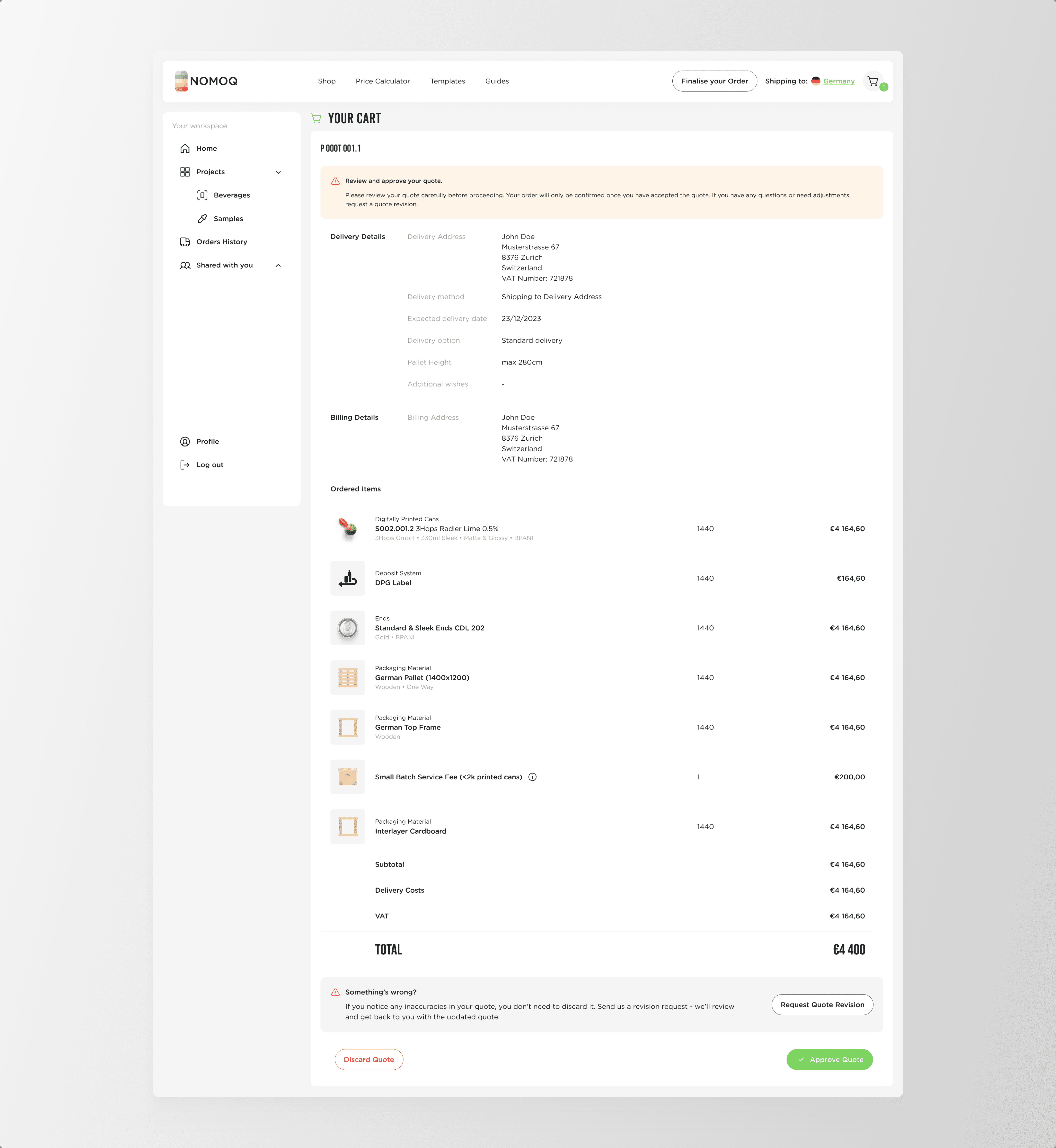
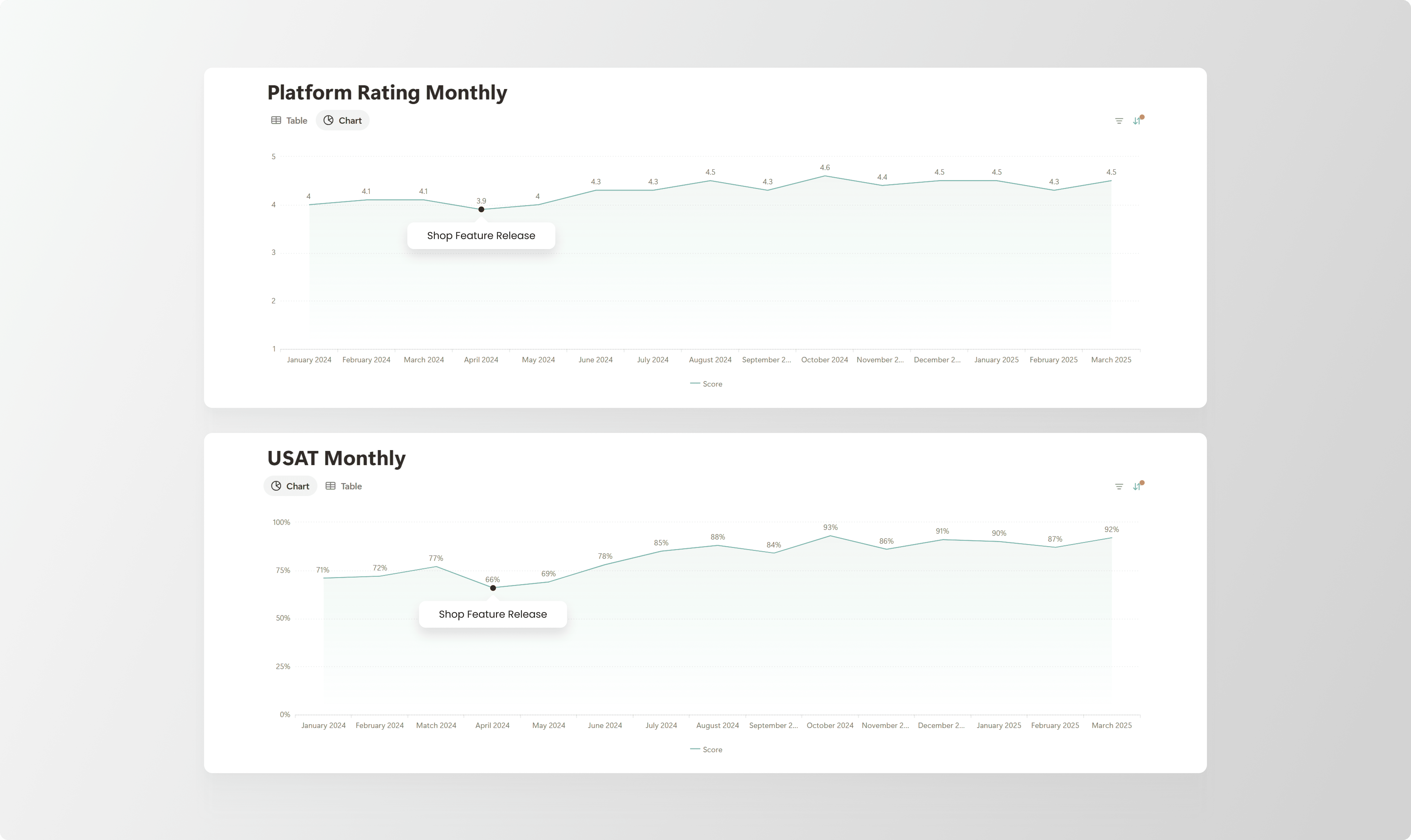
This is my favourite story from the entire project. This is how it goes: we'd just launched our big redesign, a proper web-shop that would take us from startup to scale-up. I was proud. The team was proud. Our investors were proud. Then the complaints started rolling in.
Our platform rating tanked. Support tickets multiplied like rabbits. Long-time customers were sending emails with subject lines like "WHAT HAPPENED TO MY SAMPLE BUTTON???" Not exactly the victory lap I'd imagined.
I dove into Hotjar recordings and what I saw made me want to hide under my desk. Our power users, the people who'd been with us from the day one, were completely lost. They kept looking for their beloved "Request a Sample" button, which we'd cleverly hidden three clicks deep in our new shop flow (Shop → Products → Sample Can). In our quest to be Amazon, we'd forgotten we were NOMOQ.
My solution was embarrassingly simple: I added one button. Just one. A "Request a Sample" button right on the homepage, sitting pretty next to our new "Shop" button. It was like putting up a sign that said "Old friends, click here."
The results:
✨ Support tickets dropped faster than my coffee intake.
✨ Our confused users were happily ordering samples again.
✨ Platform ratings climbed back up.
✨ And here's the beautiful part, over time, those same users started exploring the full shop flow on their own.
Sometimes the best UX solution isn't innovative or clever. Sometimes it's just giving people what they're looking for.

Agile Execution: Break it down, Review together, Ship it
Once we validated our ideas, it was time to ship. Real platform features. To real customers. Who would really complain if things went wrong.
My weekly rhythm:
Monday sprint planning where I'd negotiate features like a diplomat at the UN.
Daily standups where "it's almost done" became a running joke.
Translating Management vision into developer tasks (harder than it sounds).
Writing release notes that tried to make bug fixes sound exciting.
The paper trail I left behind
→ A Notion workspace that became our single source of truth

→ Backlogs organised with the precision of a Swiss watch
→ User stories that developers actually understood
Design Ops & System Thinking
I'll admit it. I became a bit obsessed with consistency. Not just in the product, but everywhere. I created templates for everything: presentations, emails, even our email signatures. When we went to trade shows, I designed every piece of collateral from roll-ups to booth signage. Was it overkill? Maybe. Did our brand look incredibly professional? Absolutely.


Results & Impact

After all the late nights, heated discussions and "quick fixes" that weren't quick at all, we built something that worked.
✅ Real customer love - Not just polite feedback, but genuine "this changed my business" messages.
✅ Platform ratings that made us smile - We went from 3 starts (ouch) to 4.5 stars (chef's kiss).
✅ Support teams' new favourite phrase - "Check the platform" instead of "Let me do that for you".
✅ Speed that impressed - Order confirmations that used to take days now took seconds.
✅ Operations team buying me coffee - Because the platform actually made their lives easier.
✅ Big fish coming to play - Large brands started using our "small brand" platform.
Summary
This project taught me that building a product is 20% design and 80% everything else - politics, psychology, patience and persistence. I learnt to speak multiple languages: customer, developer, operations and executive. I discovered that sometimes the best feature is the one you don't build and that a well-placed button can be more powerful than a complete redesign.
Working at NOMOQ wasn't just a job - it was a masterclass in product thinking. I was lucky to work with a team that trusted me to break things, fix things and occasionally build things that actually worked.
Together, we didn't just create a platform, we created a new way for creative brands to share their stories, one can at a time.
And yes, I still get excited every time I see a digitally printed can in the wild. That might never go away.
***