Adding more colours and graphics could add more excitement and fun to the experience, since the application will be largely used by people who like entertainment and are rather active.
Some content could be a bit more tight to save some real estate, also allowing user to expect how long the process will take (e.g. creating an event or account)
There should be an explanation of what certain provided information is used for.
Transparency
Predictability
Vivacity

The goal of creating a new UI and improving the UX, before the launch of wiinvite app, was to make sure that it will reach out and be more appealing to the young and socially active audience.

The goal of creating a new UI and improving the UX, before the launch of wiinvite app, was to make sure that it will reach out and be more appealing to the young and socially active audience.

2. So, what’s the challenge?
Product Users
Our target audience is group of population of young people in the age 14 -25 years old.

3. Solution

3. Solution

To start designing a new interface for the application, I analyzed the current structure of the interface. I gathered usage and engagement data of the experience. I also conducted market research on the today’s visual trends of applications for young people, and their succesfull as well as unsuccesfull experience examples. Based on the conclusions, I prepared preliminary sketches to improve the user experience of wiinvite app.
3.1. Previous Interface
Some of the first conclusions I have made after analyzing the interface of previous version of the app:

3.2. Market Research

3.2. Market Research

To catch up with the younger audience's expectations of the mobile applications I have conducted market research about the most appealing apps for people between 14 - 25. I singled out the three most popular ones and gathered information on what makes them so eagerly used.
What do they all have in common?
they make the users feel more connected to the people they know
they give a sense of community to the users
although they are somehow breaking design guidelines (e.g. TikTok: text overlaid on the video, Snapchat: too small icons), they appeal to the young users because they are fresh, trendy, and easy to learn and use.
3.3. Younger audience as the users
After getting acquainted with various studies on the use of the Internet by young people (also in comparision to other age groups), I distinguished and prioritized the most important insights that should be remembered when designing applications for them.
Young audience is not:
always mobile proficient across all devices
only wanting to be entertained with graphics and multimedia online
absolutely tech-savvy
wanting everything to be social
Young audience:
is hesitant to enter personal information
has less sophisticated research strategies
has insufficient reading skills
has dramatically lower levels of patience
doesn’t want overly childish content
Based on those insights I derived conclusions that helped me create a youth-friendly interface.
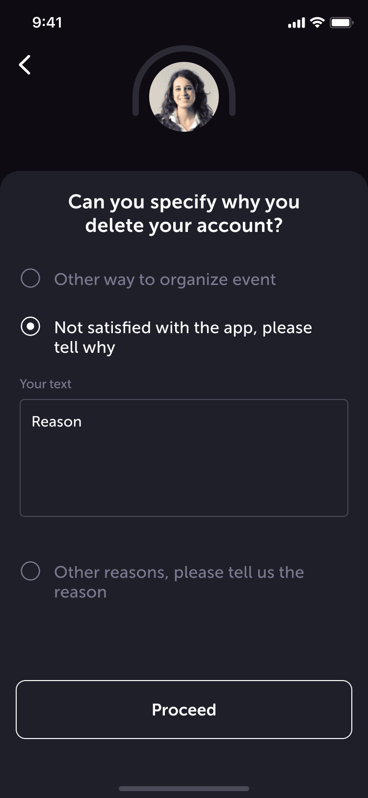
The user's provision of private information should be justified, explained, and as minimized as possible.
The application should contain only as much information as is needed and only enough graphics to keep the interest and engagement. It's needed to optimize the app's operation and to make sure that the content is not loading too long.
The content should be concise, clear, easy to perceive, and at the same time not overloaded with animations or too many fancy interactions.
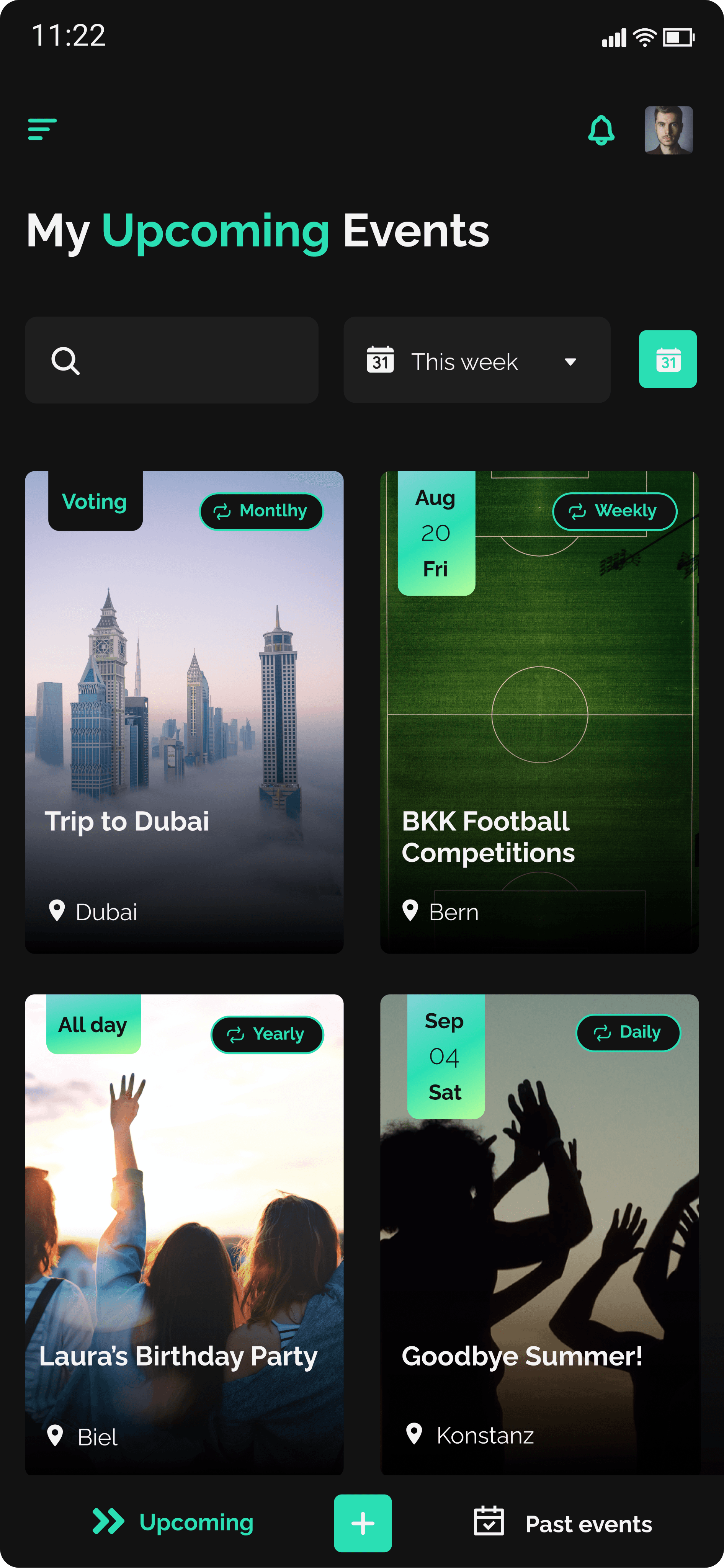
The interface should look fresh, clean, and modern. The copy should also be understandable and simple, but not childish.
The user must be able to fully control the information he shares.
3.4. User Flows

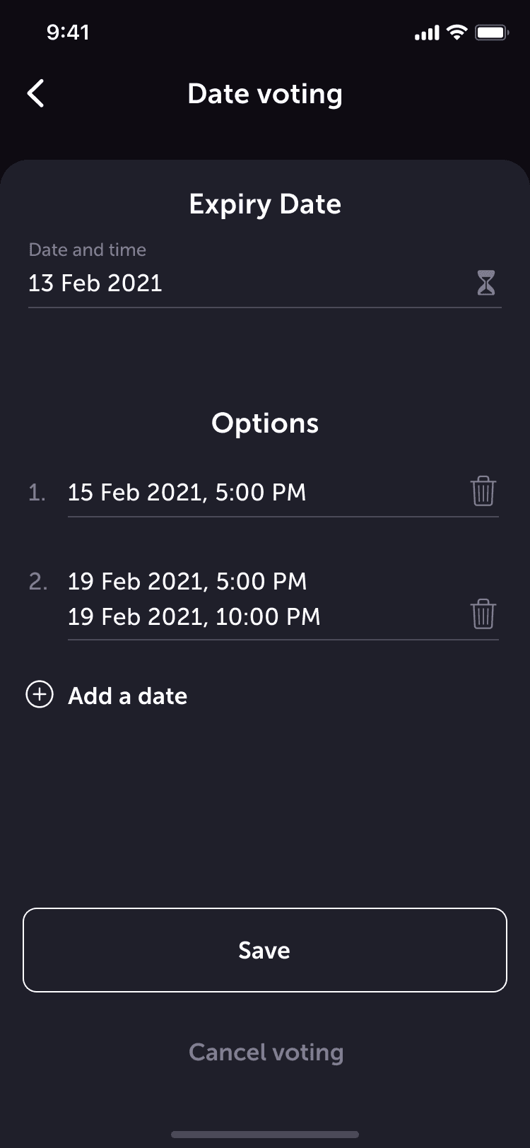
I have used Figma to prototype the full new flows of our concepts and interactions. Also, to facilitate the work with developers, we used Zeplin as a tool for managing the project progress.

I have used Figma to prototype the full new flows of our concepts and interactions. Also, to facilitate the work with developers, we used Zeplin as a tool for managing the project progress.

Login / Sign Up User Flow
Event Creation User Flow
Car Sharing User Flow
3.5. Wireframes
4. Design & Style
Logo & Colors
#F4F4F4
#1E1E1E
#2ADFB4
#2F2F2F
#121212
#595959
#898989
#83D2D7
#B9FF9B
#2ADFB4
Main Colors
Color Gradients
Typography
Raleway
Aa
ABCDEFGHIJKLMNOPQRSTUVQXYZ
1234567890

!@#$%^&*()_+?<>:”{},./\’;][=-

Main Header H1
Bold
36
Secondary Header H2
Regular
24
Subtitle
Bold
18
LABEL
BOLD
12
Link
Bold
12
Body Text
Regular
12
UI Design: Before
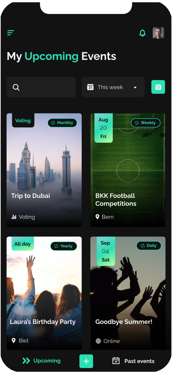
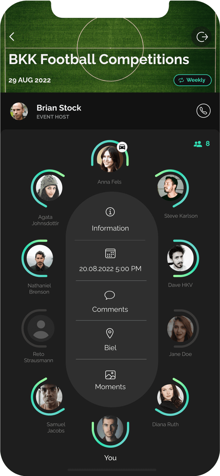
UI Design: After
Our project is by no means finished. We are currently testing our hypothesis with the Beta Version of the application, iterating functions already implemented and developing new ones. There are still a lot of interesting things coming to the life of this application, so stay tuned!
5. Next steps

Adding more colours and graphics could add more excitement and fun to the experience, since the application will be largely used by people who like entertainment and are rather active.
Some content could be a bit more tight to save some real estate, also allowing user to expect how long the process will take (e.g. creating an event or account)
There should be an explanation of what certain provided information is used for.
Transparency
Predictability
Vivacity

The goal of creating a new UI and improving the UX, before the launch of wiinvite app, was to make sure that it will reach out and be more appealing to the young and socially active audience.

2. So, what’s the challenge?
Product Users
Our target audience is group of population of young people in the age 14 -25 years old.

3. Solution

To start designing a new interface for the application, I analyzed the current structure of the interface. I gathered usage and engagement data of the experience. I also conducted market research on the today’s visual trends of applications for young people, and their succesfull as well as unsuccesfull experience examples. Based on the conclusions, I prepared preliminary sketches to improve the user experience of wiinvite app.
3.1. Previous Interface
Some of the first conclusions I have made after analyzing the interface of previous version of the app:

3.2. Market Research

To catch up with the younger audience's expectations of the mobile applications I have conducted market research about the most appealing apps for people between 14 - 25. I singled out the three most popular ones and gathered information on what makes them so eagerly used.
What do they all have in common?
they make the users feel more connected to the people they know
they give a sense of community to the users
although they are somehow breaking design guidelines (e.g. TikTok: text overlaid on the video, Snapchat: too small icons), they appeal to the young users because they are fresh, trendy, and easy to learn and use.
3.3. Younger audience as the users
After getting acquainted with various studies on the use of the Internet by young people (also in comparision to other age groups), I distinguished and prioritized the most important insights that should be remembered when designing applications for them.
Young audience is not:
always mobile proficient across all devices
only wanting to be entertained with graphics and multimedia online
absolutely tech-savvy
wanting everything to be social
Young audience:
is hesitant to enter personal information
has less sophisticated research strategies
has insufficient reading skills
has dramatically lower levels of patience
doesn’t want overly childish content
Based on those insights I derived conclusions that helped me create a youth-friendly interface.
The user's provision of private information should be justified, explained, and as minimized as possible.
The application should contain only as much information as is needed and only enough graphics to keep the interest and engagement. It's needed to optimize the app's operation and to make sure that the content is not loading too long.
The content should be concise, clear, easy to perceive, and at the same time not overloaded with animations or too many fancy interactions.
The interface should look fresh, clean, and modern. The copy should also be understandable and simple, but not childish.
The user must be able to fully control the information he shares.
3.4. User Flows

I have used Figma to prototype the full new flows of our concepts and interactions. Also, to facilitate the work with developers, we used Zeplin as a tool for managing the project progress.

Login / Sign Up User Flow
Event Creation User Flow
Car Sharing User Flow
3.5. Wireframes
4. Design & Style
Logo & Colors
#F4F4F4
#1E1E1E
#2ADFB4
#2F2F2F
#121212
#595959
#898989
#83D2D7
#B9FF9B
#2ADFB4
Main Colors
Color Gradients
Typography
Raleway
Aa
ABCDEFGHIJKLMNOPQRSTUVQXYZ
1234567890

!@#$%^&*()_+?<>:”{},./\’;][=-

Main Header H1
Bold
36
Secondary Header H2
Regular
24
Subtitle
Bold
18
LABEL
BOLD
12
Link
Bold
12
Body Text
Regular
12
UI Design: Before
UI Design: After
Our project is by no means finished. We are currently testing our hypothesis with the Beta Version of the application, iterating functions already implemented and developing new ones. There are still a lot of interesting things coming to the life of this application, so stay tuned!
5. Next steps

wiinvite
Event Organizing App Design
wiinvite
Event Organizing App Design
wiinvite
Event Organizing App Design
wiinvite
Event Organizing App Design
Adapting the interface to the needs of the target group.

The purpose of creating the wiinvite application was to enable young people to organize social events in an extremely easy, fun and fast way. This goal was achieved by creating a unique and easy-to-use interface.

The purpose of creating the wiinvite application was to enable young people to organize social events in an extremely easy, fun and fast way. This goal was achieved by creating a unique and easy-to-use interface.

The purpose of creating the wiinvite application was to enable young people to organize social events in an extremely easy, fun and fast way. This goal was achieved by creating a unique and easy-to-use interface.

LIQUET AG

LIQUET AG

LIQUET AG

UX/UI Designer, Content Creator
May 2021 - Ongoing

wiinvite.com

wiinvite.com

wiinvite.com

1.
Overview
2.
The Challenge
4.
Design & Style
5.
Next Steps
3.
Solution

Let's talk business.

But we can also chat. It would be fun too.

Let's talk business.

But we can also chat. It would be fun too.

Let's talk business.

But we can also chat. It would be fun too.

Mobile App
Mobile App
Mobile App
UI/UX
UI/UX
UI/UX
UI Design
UI Design
UI Design
Yes, there’s more.
***
***
Yes, there’s more.