In today’s world, more and more purchases are made online. The availability and ease of buying clothes online have become a standard. I thought that it would be worth taking a look at the possibilities offered by the application of well-known retailer brands and consider how the user experience can be improved.
Zara is one of the most recognizable apparel retailer company which specializes in fast fashion. It provides a high quality of services, but when I became familiar with the features offered by online store applications, I noticed that the Zara application is not very popular. I decided to find out why and try to improve its usability while practicing my skills and deepening my knowledge of UX design.
Zara is one of the most recognizable apparel retailer company which specializes in fast fashion. It provides a high quality of services, but when I became familiar with the features offered by online store applications, I noticed that the Zara application is not very popular. I decided to find out why and try to improve its usability while practicing my skills and deepening my knowledge of UX design.
2. The Challenge
The purpose of the redesign of the application was to improve its user experience as well as the app’s performance and ratings. When I started delving into its functioning, I noticed that one of the problems may be the navigation of the application. I decided to identify other issues that users may struggle with
3. Research
3.1. User Research
While browsing through user reviews, I encountered a few recurring problems that could be the reason why the app may have an unflattering opinion. Some of the main disadvantages that users wrote about were poor customer service, misleading size suggestions, lack of information about the delivery time, and inflexible payment methods. Besides that, from the interface side, users were often disappointed with:
Lack of “Sort” option (user cannot sort products, e.g. by price)
Lack of an intuitive navigation through the app
Difficulty to return from the selected product to “view products” in a given category (after returning from a given product, the user is sent back to the beginning and leaves the category that was being viewed).
3.2. Comparative and Competitive analysis
Based on User Feedback I had some initial insights for the Zara App. The next step I was going to take was to turn to the competition and see how that operates. I have gained further understanding of what Zara’s users might expect and how the app could improve that experience
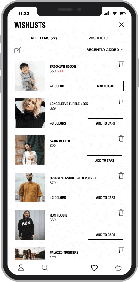
From the analysis, it was evident to me how other shopping apps allowed their users to navigate intuitively, filter efficiently, sort products, and create different wishlists.
From the analysis, it was evident to me how other shopping apps allowed their users to navigate intuitively, filter efficiently, sort products, and create different wishlists.
From these opinions, I have abstracted the main pain points which I decided to work on.


3.8
4.8
4.7
4.7
Intuitive navigation
Filter by price, material, product type
Ratings (based on PlayStore)
Design that fits company’s branding and is User Friendly at the same time
Creating wishlists
Sort Product option
4. Design
4.1. Thumb Zones
After researching and analyzing problems related to Zara’s app I decided to improve its usability by:
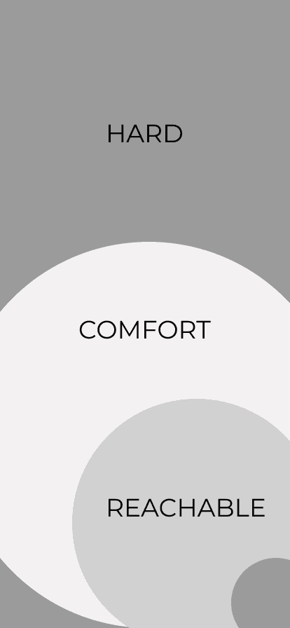
For large phones, the zones of comfortable reaching the elements on display look a bit different than for the small ones. Therefore, based on the research, I prepared a map, on the basis of which I have created the wireframes’ layout.
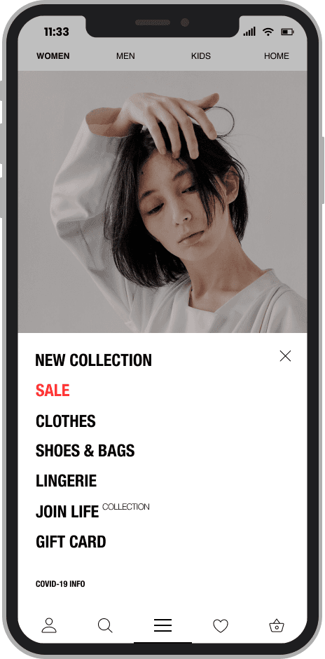
Creating a more Intuitive Navigation
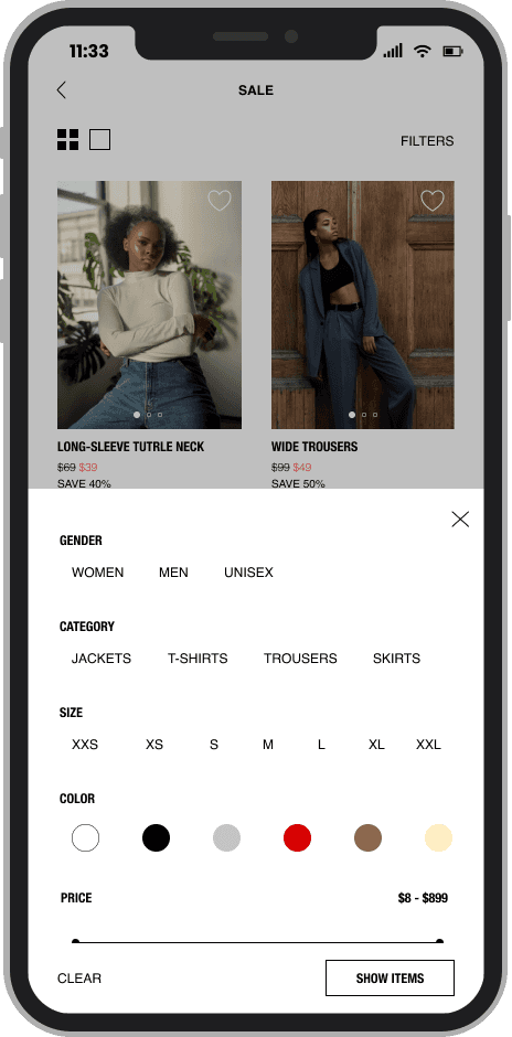
Improving the Filter Feature
Adding Sort Products Option
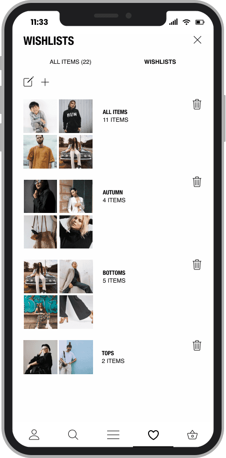
Adding possibility to create Different Wishlists
The look of the app to fit Zara’s branding and be user-friendly
4.2. Wireframes
I started the introduction and improvement of individual functions of the app with the preparation of wireframes in Figma, which was to be an attempt at various arrangements of the application components and was to be the basis for the subsequent UI design based on it. Since I wanted to create a prototype of an improved version of the App for the iPhone 11 Pro Max (with display resolution 2688×1242 pixels), and since 49% of users hold their phones with one hand (Hoober S., 2013), I had to take the Thumb Zone map into consideration.
4.3. UI Design
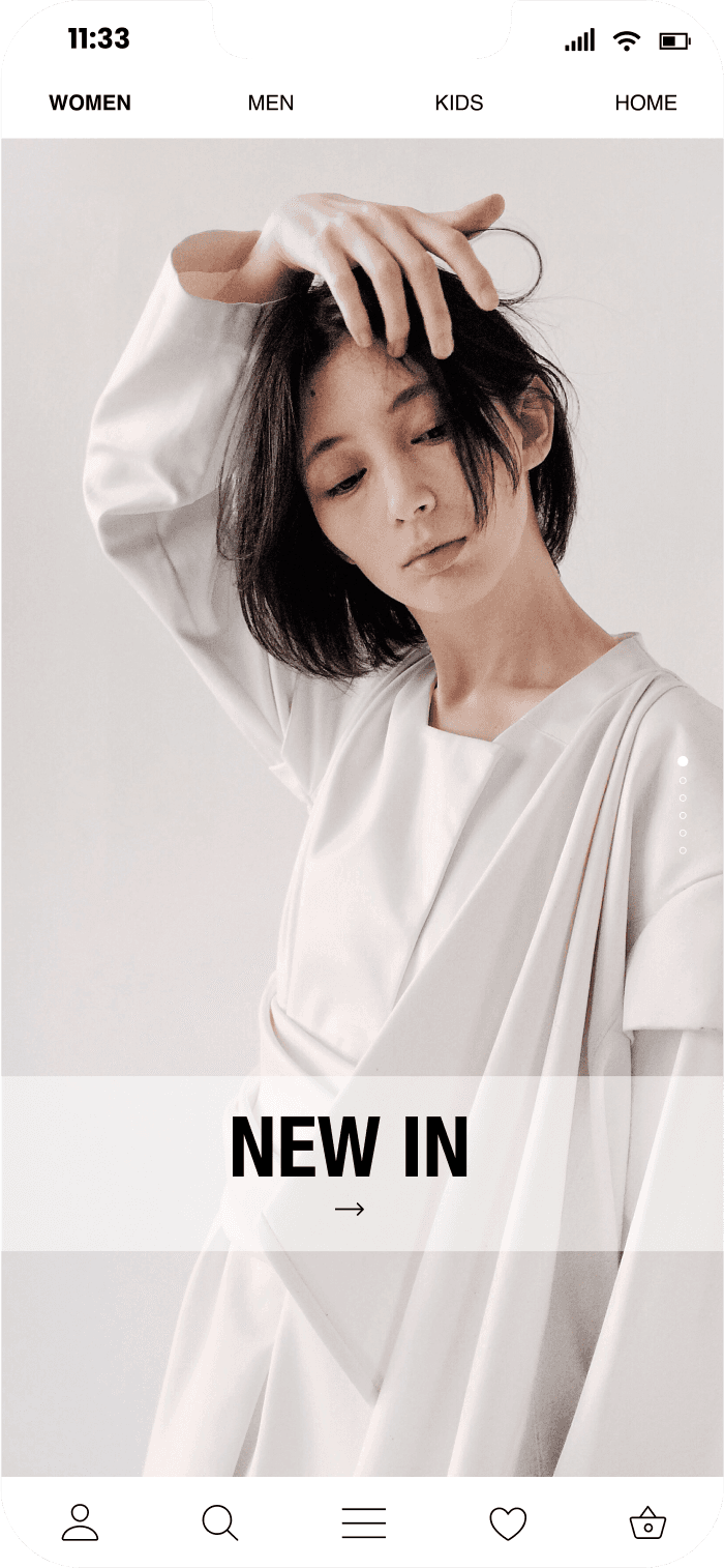
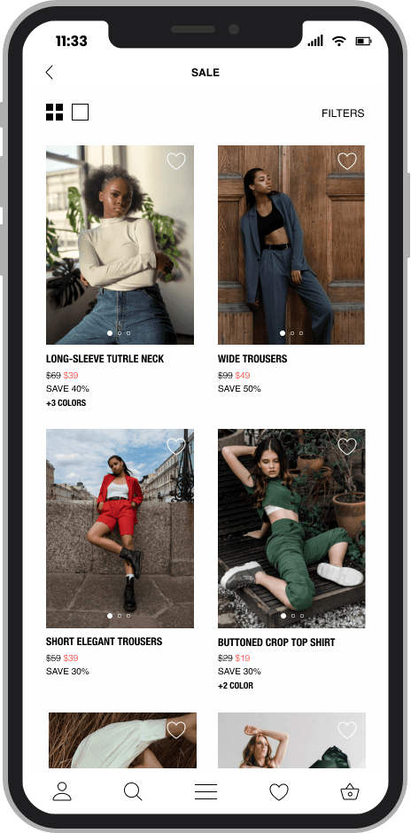
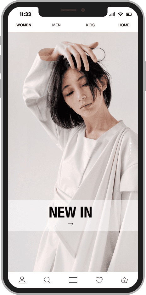
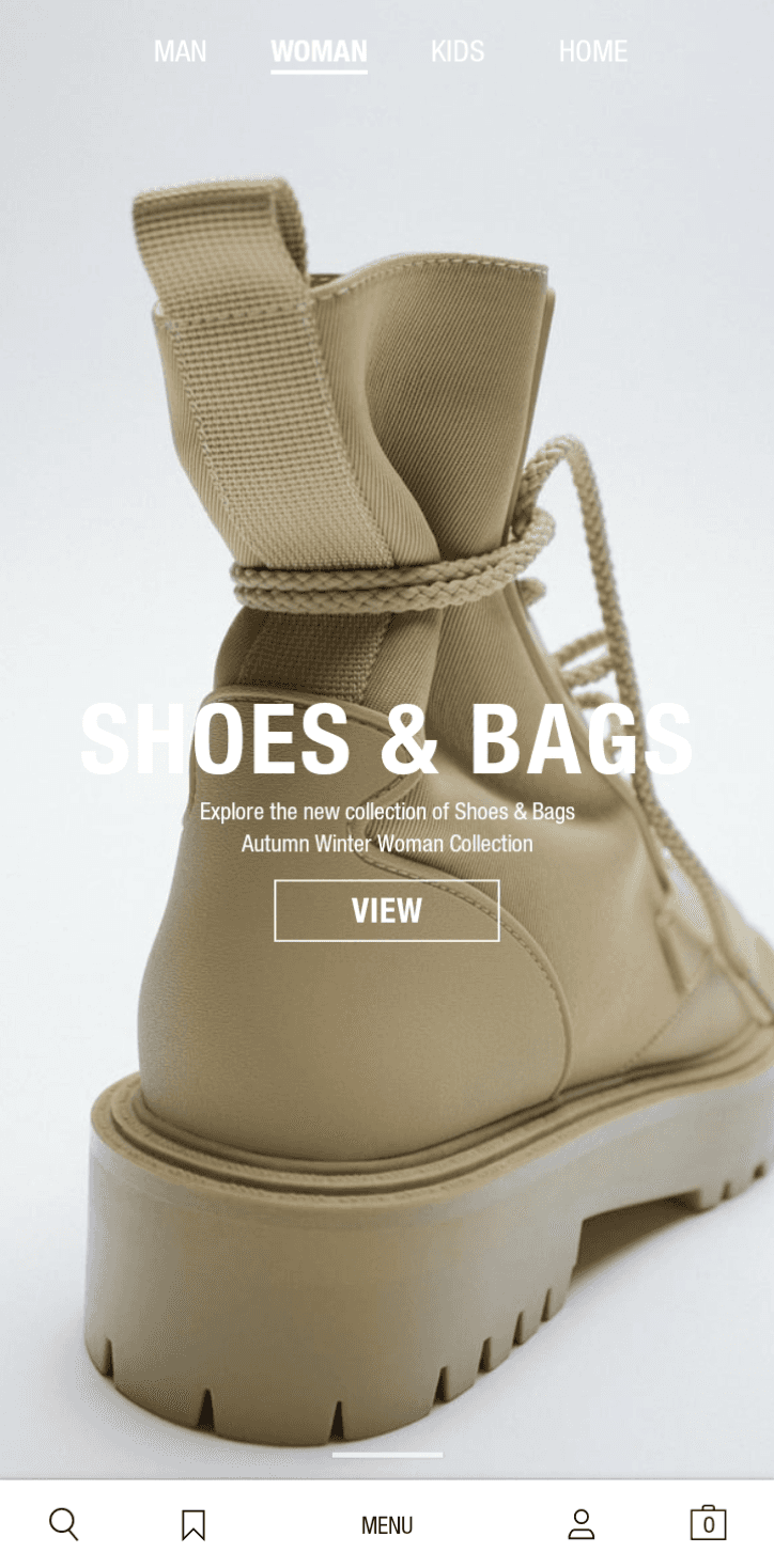
The general layout of the Zara App is minimal and simple It has a white background with bold black Helvetica Neue as well as Helvetica fonts used throughout the App. Following this style, I created a prototype of an improved version of the application.
4.4. Before & After
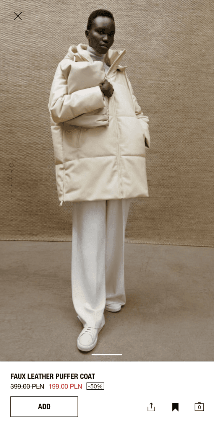
added background behind the text to avoid lack of sufficient contrast
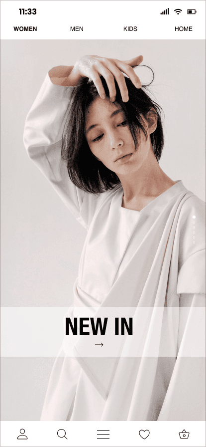
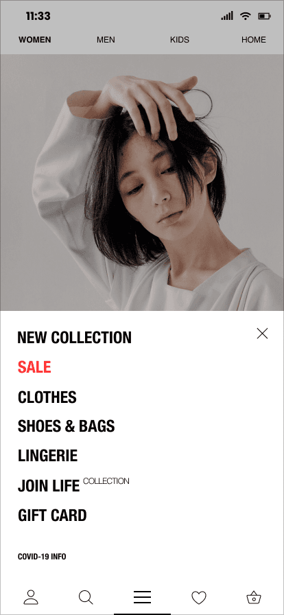
less stretched menu, making it easy to reach content effortlessly with one hand
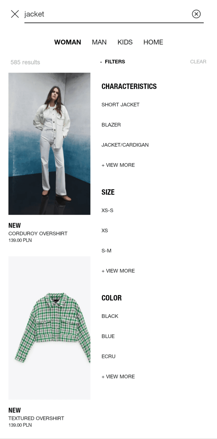
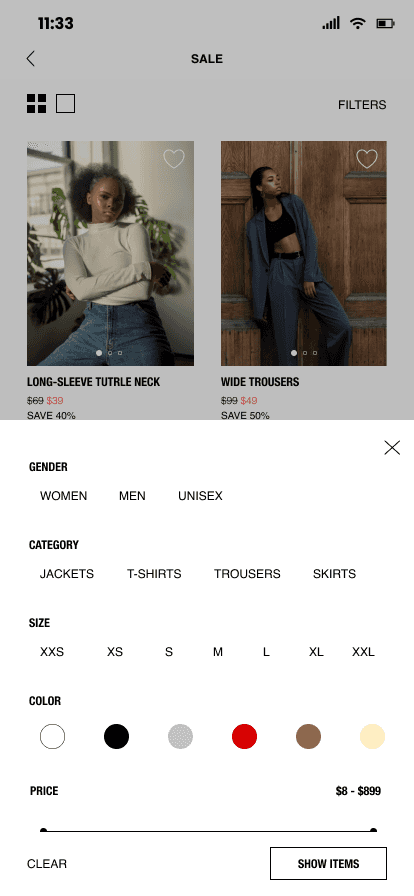
filters enriched with sorting and other useful filtering options
changed icons to be more recognizable
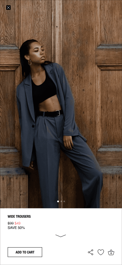
more standard photo browsing function (horizontal)
floating panel with the option of "add to cart", "share", "add to favorites" and "view the basket", at every stage of viewing product details
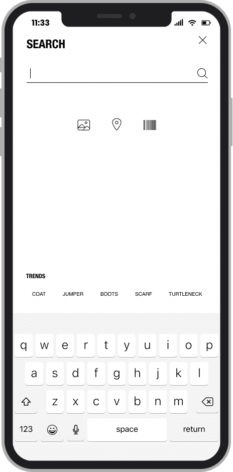
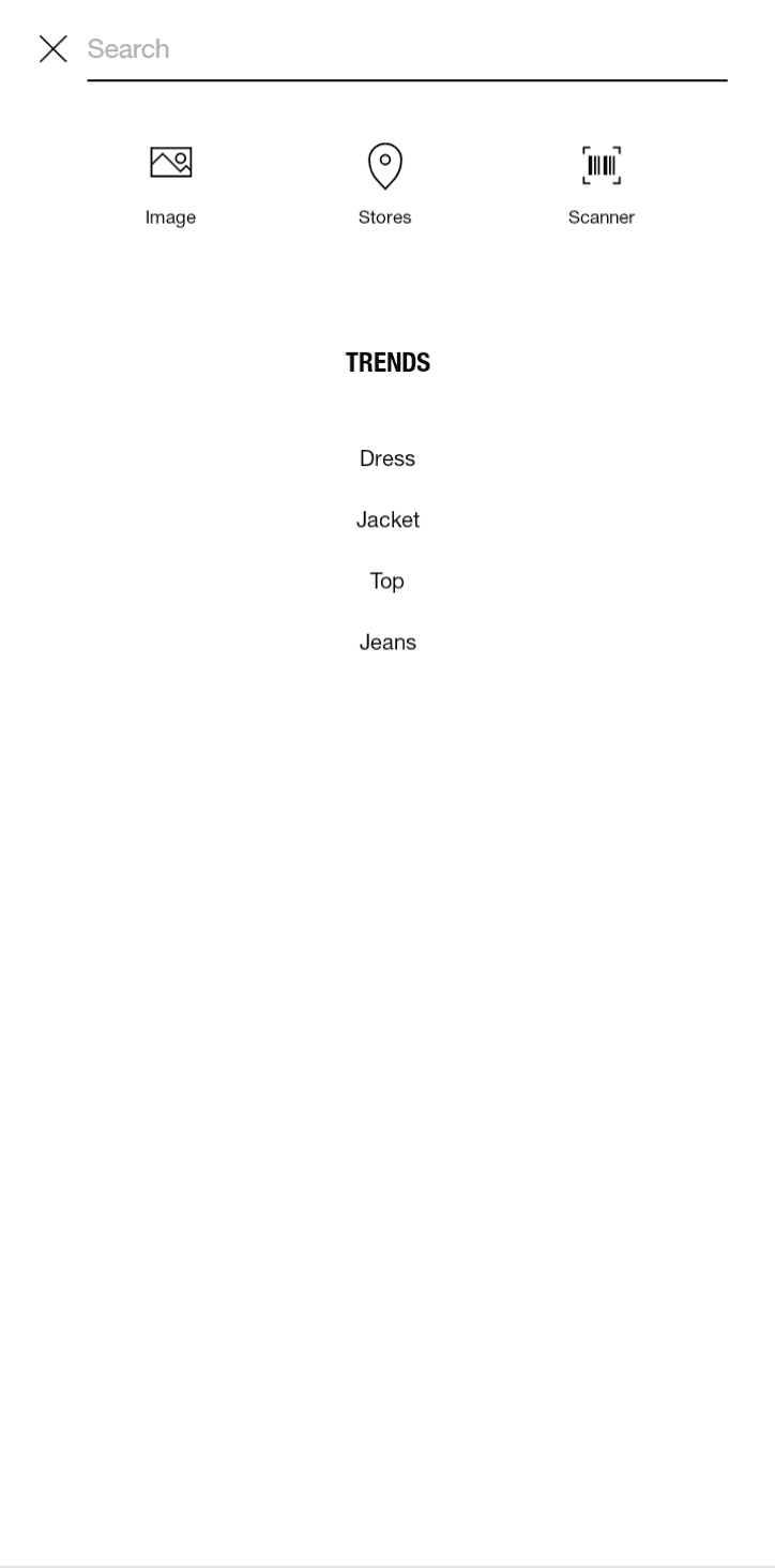
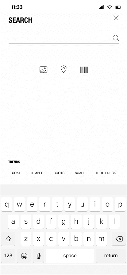
Trends and recent searches in a place more accessible to the thumb and a keyboard that pops up immediately after clicking on the search option, instead of double-clicking (first clicking the magnifying glass, then reaching to the top to the text field to search for something)
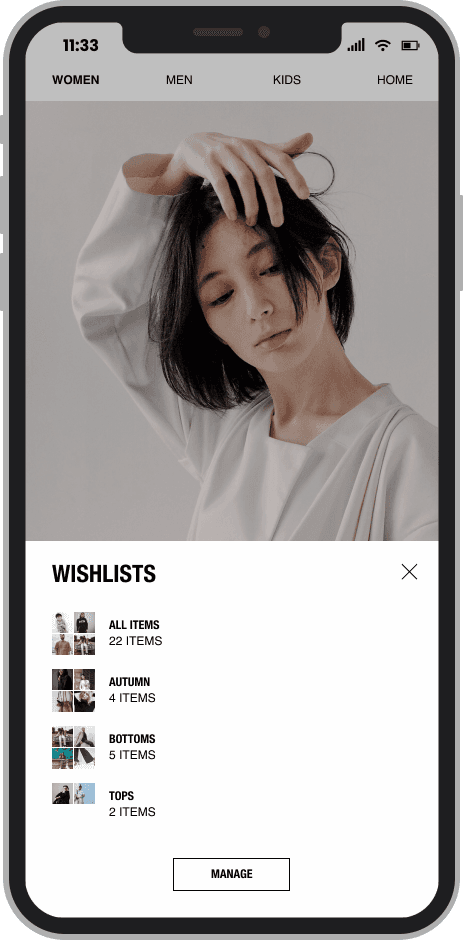
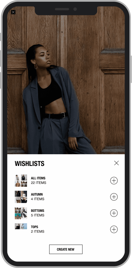
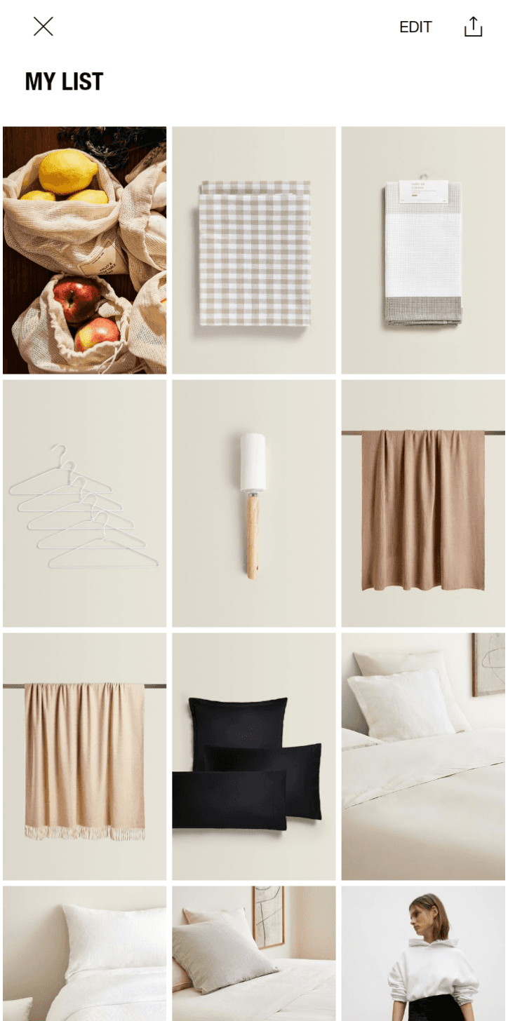
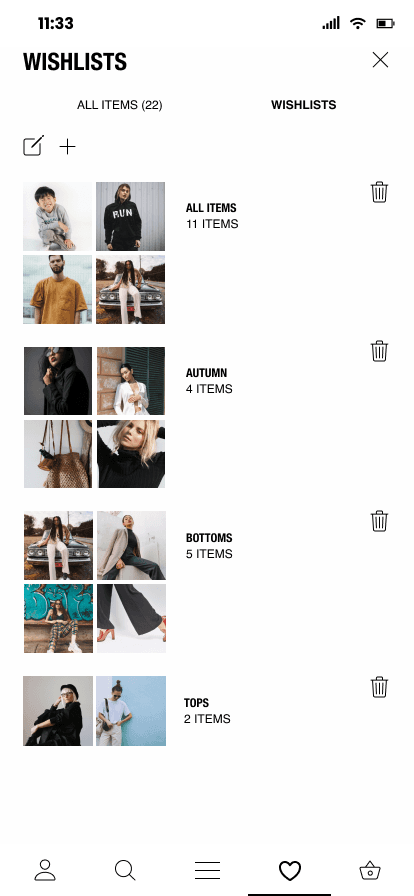
Option to add products to the list of favorites enriched with the possibility of dividing them into categories (adding different wishlists depending on preferences)
***
Yes, there’s more.

Exploration
In-App Gratification UXR
See Project
wiinvite
Event Organizing App Design
See Project
yamko*
Personal Portfolio Website Design
See Project
Since I did not want to change the overall appearance of the application, but only improve and add some features, I had to focus on user feedback, which helped me see their needs and apply answers to them in the application’s redesign. Thanks to this trial, I learned how important it is to take into account the opinions and expectations of users and that, as in other aspects of life, in addition to being aesthetically pleasing, the form should also carry meaningful content.
5. Conslusions
